Introducing the all-new analytics dashboard inside Zenduty

Last updated
Getting quick insights from your past incidents is now easier than ever.
We’re excited to introduce the all-new Analytics Dashboard, a major update that gives you deeper insights than ever before.
Effective incident management means looking beyond the immediate problem to understand what's really happening. It’s about spotting patterns, fine-tuning your processes, and constantly getting better.
To give teams deeper insights, we've rebuilt the system with advanced filtering, interactive visuals, and a centralized hub. You can now stop running after problems and start driving real improvement.
Stop digging through different tabs to find what you need. Our new, enhanced dashboard puts all the important insights from your incidents in one place. It gives you the power to filter, visualize, and take action on incident data, turning raw metrics into real intelligence. This update redefines how insights are gained, whether you're a manager benchmarking team performance or an ops lead tracking individual contributions.
Read on to see how this updated dashboard makes things smoother for you.
A Look at the Essentials of Our Early Dashboard
While the older version of our analytics dashboard served its purpose, here's a quick look at its key features and areas where it could use a boost:
- Basic Overview Metrics: It displayed totals for incidents, including triggered, acknowledged, and resolved counts, along with user-specific incidents.
- Limited Filtering Options: Filters were available for time to acknowledge and resolve, urgency, priority, tags, and whether to include or exclude merged incidents (showing parent-only or both parent and child incidents). However, these were rigid and often required manual selection for each view.
- Scattered Navigation: Switching between teams (e.g., Kafka or Backend) or services meant hopping through menus, with no support for multi-team analysis in a single glance.
- Minimal Visuals: Data was mostly numerical, with basic graphs but no dedicated trend lines for key metrics like Mean Time to Acknowledge (MTTA) or Mean Time to Resolve (MTTR). Interactive elements were absent, making it hard to spot trends over time.
- Export Capabilities: Users could download reports or print graphs, but these felt like bolt-on features rather than an integrated part of the experience.
Our previous dashboard has served our customers for a good time, but our product team wanted to build an even more powerful analytics tool for your engineers. We've upgraded it with more data and new features to give you a clearer view than ever.
What’s Changed? How the New Dashboard Transformed Analytics
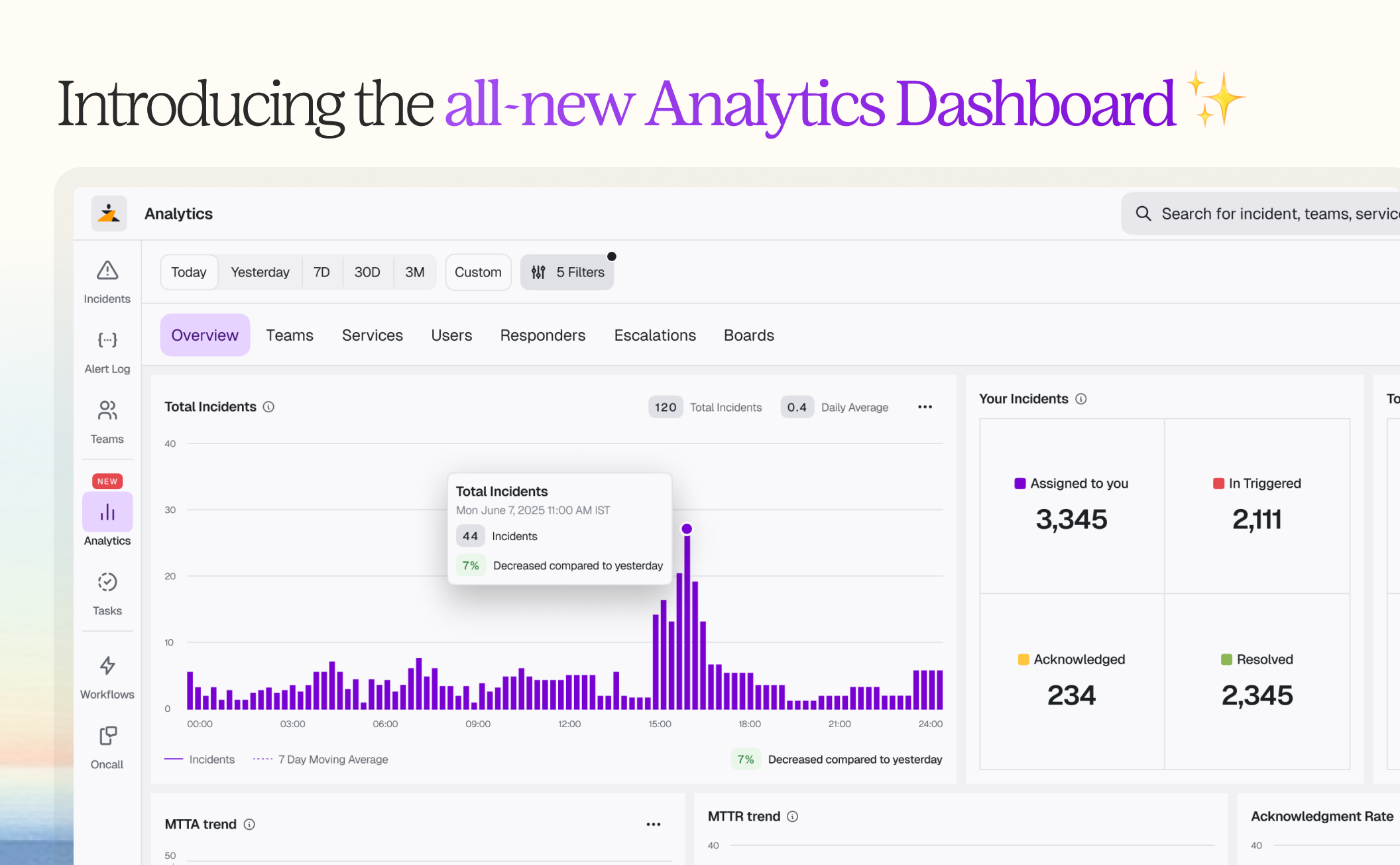
We've listened to your feedback and significantly upgraded the analytics experience. Now you’ll be able to see a dedicated, intuitive space that centralizes everything you need for incident analysis.
The upgraded dashboard brings analytics into a single, unified space:
1. A Purpose-Built Analytics Environment
Everything now lives within a dedicated analytics section, with no digging through menus.
- Key Metrics: Here are the key metrics:
- Total incidents (for example, in the above attached snapshot, it’s 67)
- user incidents (17)
- acknowledged (39 user, 15 total)
- resolved (28 total)
- triggered (0).
- Trend Graphs: Check out live line charts for total incidents, MTTA, MTTR, and acknowledgment rates.
- Dynamic Time Ranges: Quickly analyze incidents over different periods with our new dynamic time ranges. You can select from presets like Today, Yesterday, 7D, 30D, and 3M, or set your own custom range to instantly focus on the exact data you need.
2. Filters That Actually Work for You
Users can now filter across multiple dimensions, such as teams, services, users, and even escalation policies. Multi-team selection means broader, comparative analysis is now effortless.
- Multi-Select Across Categories: Pick multiple teams (Backend and Infra, anyone?), services, users (like “Mahesh”), or even escalation policies.
- Inclusive Options: Toggle to include or exclude merged incidents, and layer filters for urgency, priority, or tags.
- Real-Time Updates: As you apply filters, graphs and metrics refresh instantly, enabling comparative analysis without reloading or switching views.
No more one-team-at-a-time limitations, now you can benchmark performance across your entire organization seamlessly.
3. Tabs Tailored to Your Role
Whether viewing by Teams, Services, or Users, each tab offers neatly organized insights. Drill in for deeper context or stay on the overview for full visibility.
- Teams Tab: See how everyone’s doing with a pie chart (e.g., Kafka with 8 incidents, Backend with 4). Click a team to dive deeper into their services or users.
- Services Tab: Focus on service-level performance, identifying bottlenecks in specific areas.
- Users Tab: Track individual contributions, like acknowledgements and resolutions, to support coaching or recognition.
4. Rich Visualizations and Interactivity
Graphs are interactive. Hover to see daily numbers, track trend lines, and visually spot patterns or anomalies. Every graph is now interactive and visually engaging:
- Line trends with 7-day moving averages for smoother pattern recognition.
- Bar charts and pies for quick comparisons (e.g., MTTA by team: Kafka at 33 sec, Backend at 3:17 min).
- Export enhancements: Download reports or print with the same ease as before, but now with richer data included.
Real-World Use Cases:
To help illustrate how these improvements play out for your engineers, here are three scenarios that demonstrate the new dashboard’s value:
Use Case 1: Comparing Teams Made Easy
An engineering manager needs to compare the MTTR (Mean Time to Resolution) for the Backend and Kafka teams over the last 30 days. In our previous dashboard, this meant repeatedly toggling between different views.
Now, it's a one-step process. You can select both teams in the filter, and the dashboard will overlay their trends on a single chart, making it easy to see their performance side-by-side.
Use Case 2: Investigating Escalation Delays
A Product Owner suspects that incidents escalated to a particular policy are taking too long to be resolved. Previously, they had no way to verify this.
Now, the new Escalation Policy filter provides a dedicated view with all the metrics and trend visuals they need. This allows them to quickly see exactly where delays are happening and adjust their workflows accordingly.
Use Case 3: Keeping Tabs on Team Members
An Operations Lead wants to understand how a specific team member, let’s say ‘Mahesh’, is performing. Previously, this meant digging through various reports to see how many incidents he acknowledged versus resolved, and how his work compared to the team average.
Now, they can use a simple filter in the ‘Users’ tab to get a complete performance snapshot. This new view helps the lead quickly monitor individual contributions, making it easier to recognize or coach team members effectively.
How It Works
The new Analytics Dashboard is designed for ease of use and powerful functionality. Access it through the dedicated "Analytics" tab, where a clean interface greets users. Navigate using the Overview tab for a high-level snapshot or dive into the ‘Teams’, ‘Services’, and ‘Users’ tabs for detailed analysis. Apply filters by selecting multiple ‘teams’, ‘services’, or ‘users’, and adjust time ranges with preset options or custom dates. Interactive graphs update in real time, allowing users to hover for daily details or export reports with a single click.
Benefits for Teams
This update brings significant advantages to enhance team performance:
- Enhanced Visibility: Real-time graphs and metrics provide clear insights into incident trends and team efficiency.
- Improved Decision-Making: Flexible filters and comparative analysis enable quicker, data-driven actions.
- Time Savings: Streamlined navigation and automated updates reduce manual effort, freeing teams to focus on resolution.
Thank you for trusting us to be a part of your incident management journey. We're excited for you to see the impact the new dashboard will have on your team's efficiency and insights.
We're already looking ahead, with more features and updates planned to help your team continue to succeed.

Get started with a free 14-day trial of our incident management platform. Build resilient response plans and get deeper insights into your data.
Ready to enhance your insights from incident data? Sign up to experience the new Analytics Dashboard today! If you have feedback or questions, feel free to contact our support team—we’re here to assist.
Join us at Xurrent Connect 2025! 🎉
Are you attending the conference in Antwerp this September 8th? Stop by our booth to chat about all things Service Management and see how our platform can help you drive real transformation.
We’d love to connect in person!


